Skip to content

Changelog

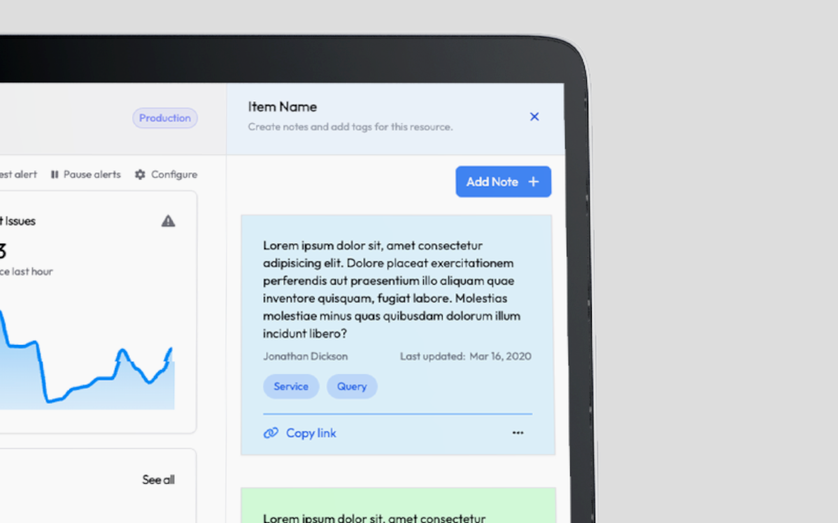
Notes Feature

Notes Feature

We are excited to announce the introduction of the Notes feature in Megapixel CLOUD with this latest update.

This new functionality allows users to create, manage, and access notes directly linked to pages, projects, systems, and agents, enhancing communication, record-keeping, and operational efficiency.

Users can add notes through the dedicated Notes panel, on a comprehensive Notes page, or contextually via the ellipsis menu on each item.

Notes can be accessed either through a newly added main navigation item called “Notes” or via a notes icon on individual items.

Additionally, this feature includes the ability to color code notes, providing a visual method to organize and prioritize information, facilitating better management and quicker decision-making processes.

This update significantly boosts our platform’s capability to streamline project management and improve team collaboration with robust and intuitive note-taking features.

Add Search Functionality

Search Field

We are pleased to announce the new release of Megapixel CLOUD, which includes several improvements and updates to enhance your user experience.

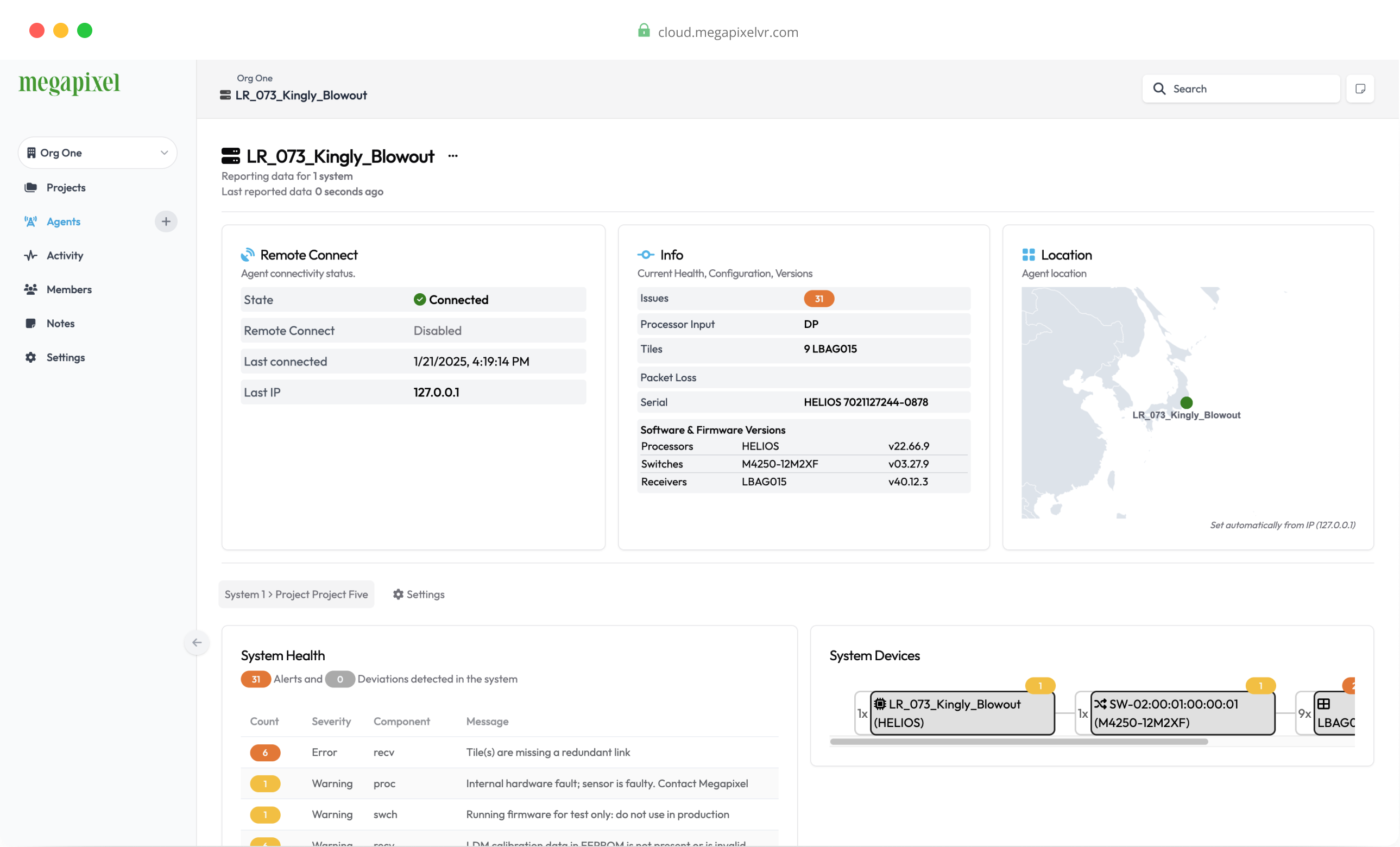
In this version, we’ve reintroduced a search field into the main header, allowing you to easily search for projects, agents, and systems.

Email Headers

Email pre-headers have been updated to provide better context to the email content.

Sort Organizations

Additionally, you can now sort organizations, making it easier to manage and find what you need.

The sidebar will also retain its collapse state, providing a more consistent and streamlined navigation experience.

Enjoy these new features and improvements! If you have any questions or need assistance, please contact our support team.

Refactor Connect Button

We are excited to release the latest update, featuring several enhancements and fixes.

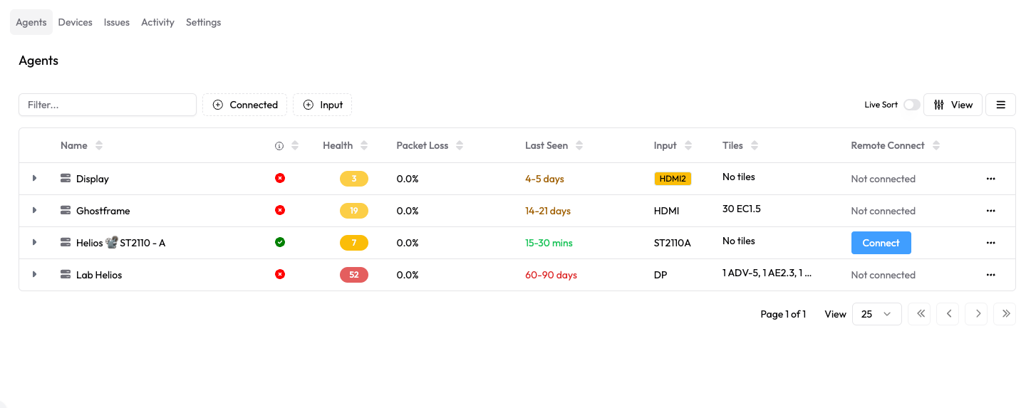
This update includes the removal of unnecessary fallback mechanisms, and a refactored agent connect button with edge case handling for smoother operation.

Tooltips on missing processor inputs have been updated to suppress when empty, and the help and support links in the sidebar have been updated. Badge width has been fixed for better visual alignment, and the input field size in the enroll agent form has been increased for improved usability.

These updates aim to enhance your experience with Megapixel CLOUD by providing more reliable functionality and a cleaner interface. If you have any questions or need assistance, please contact our support team. Enjoy the new features and improvements!

Quick Add Agents

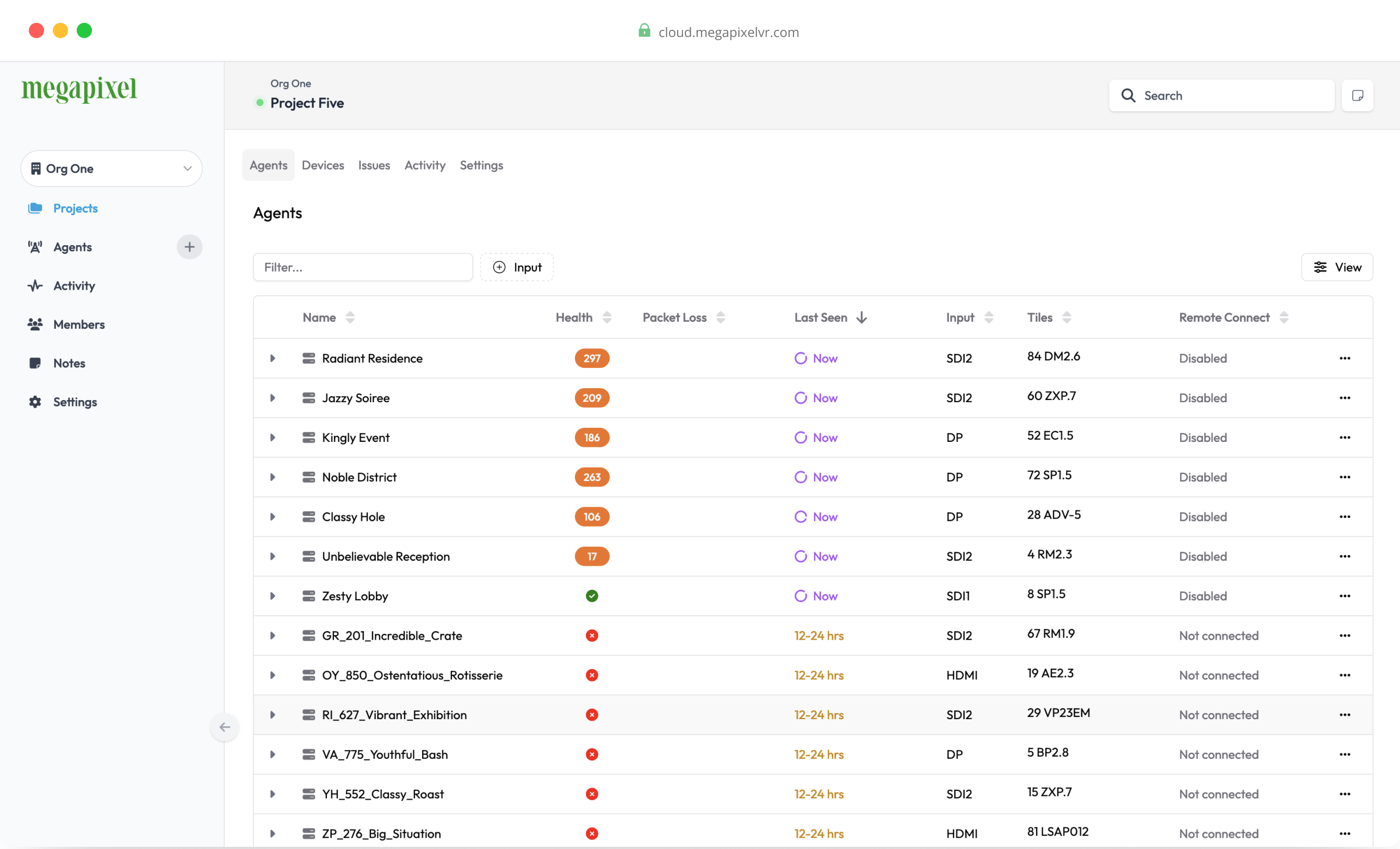
In this update, we’ve added a new button in the sidebar that allows you to quickly and easily add Agents, streamlining your workflow and saving time. Additionally, we’ve addressed the infinite scroll issue on Activity pages, ensuring a smoother and more reliable user experience.

To provide more space for the main content, we’ve made the sidebar narrower. This change helps to focus on the essential parts of your work while keeping the navigation accessible. We’ve also fixed various tooltips and introduced a new style for issue summaries within tooltips, enhancing clarity and usability.

Table fixes have been implemented to improve data presentation and interaction. Moreover, we’ve introduced a new badge style for issues, which includes updated colors for better visual differentiation and emphasis.

Megapixel CLOUD v2.0

Cloud v2.0 Projects Page Screenshot

We are excited to announce the release of Megapixel CLOUD v2.0, bringing a host of new features and improvements to enhance your user experience.

In this major update, we’ve revamped the login and sign-up page with a fresh, new design, ensuring a more engaging and streamlined process. Alongside this, we’ve completely redesigned the user interface to offer a modern and intuitive layout that significantly improves navigation and accessibility.

To experience the new user interface, simply navigate to your account preferences and select “Enable new UI”.

While we maintain the familiar sidebar or vertical navigation from the previous design, we’ve introduced several new elements to enrich your interaction with the platform. These include an organization switcher and additional top-level navigation items, all within a minimalist design. The new interface employs a mainly monochromatic color scheme, helping to keep the focus on the main content. It’s simple, clean, and functional, with a strong emphasis on ease of navigation.

Located at the bottom of the sidebar, the user account area provides easy access to essential features, including:

  • Help Section
  • What’s New
  • User Profile
  • Appearance
  • Notifications

Additionally, we have introduced new email design templates, offering a more consistent and aesthetically pleasing communication experience.

We hope you enjoy the improvements and new features in Megapixel CLOUD v2.0. If you have any questions or need assistance, please contact our support team. Enjoy the new features!